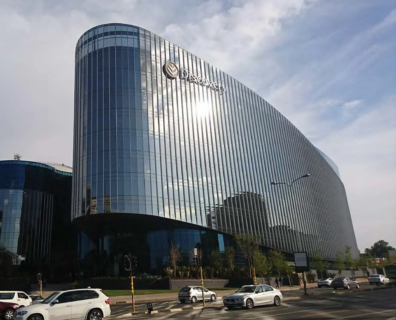
1 Discovery Place
We were brought onboard to create a design system that would establish the Discovery brand within its new headquarters.
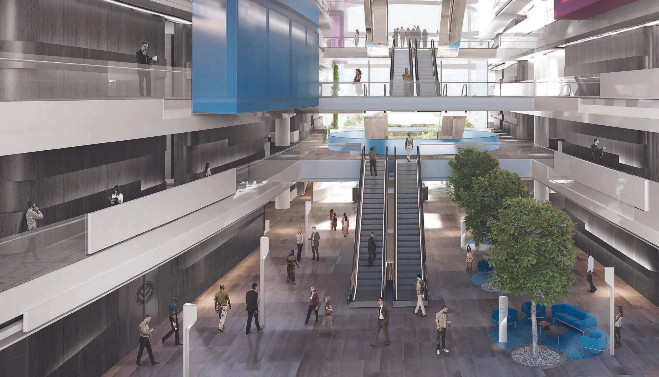
The building itself was part of a strategy to unify the various sub-brands and use the building to exemplify a singular customer experience.
Our design system provided a living 3D identity by integrating the Discovery brand into the architectural aesthetics.
This served both the aesthetic and functional requirements of the building and the brand.
Our scope of worked increased during the project to include a full suite of brand collateral and various industrial design and interior projects, all of which we saw through from inception to quality control and snagging.
Concept
The concept behind the design system was strategically aligned with the goal of 1 Discovery Place being a unifier for both the business and the brand. In the same way, this rationale had to bring together people from various disciplines to make informed design decisions.
The way the concept was articulated/structured served as a guide for project teams and provided a shared language to mitigate diverging views among leadership, ensuring decisions were consistent with the overarching vision.
What if you put Wellness under the microscope?
You would find intricate frameworks, cells, particles...
But like Discovery; it’s people; this building:
you will find that together...
...it is greater than the sum of its equal parts.
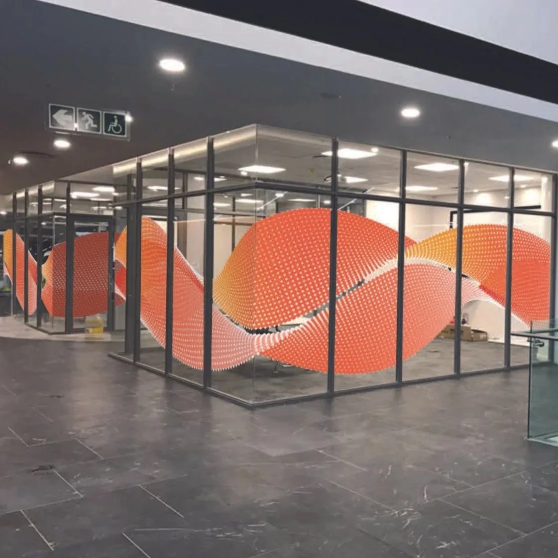
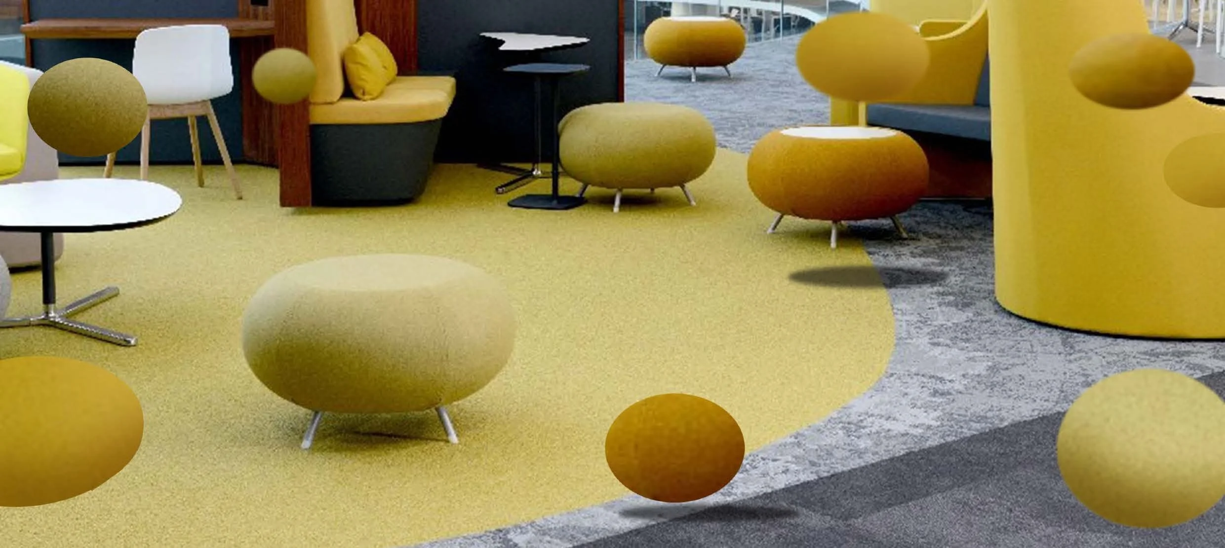
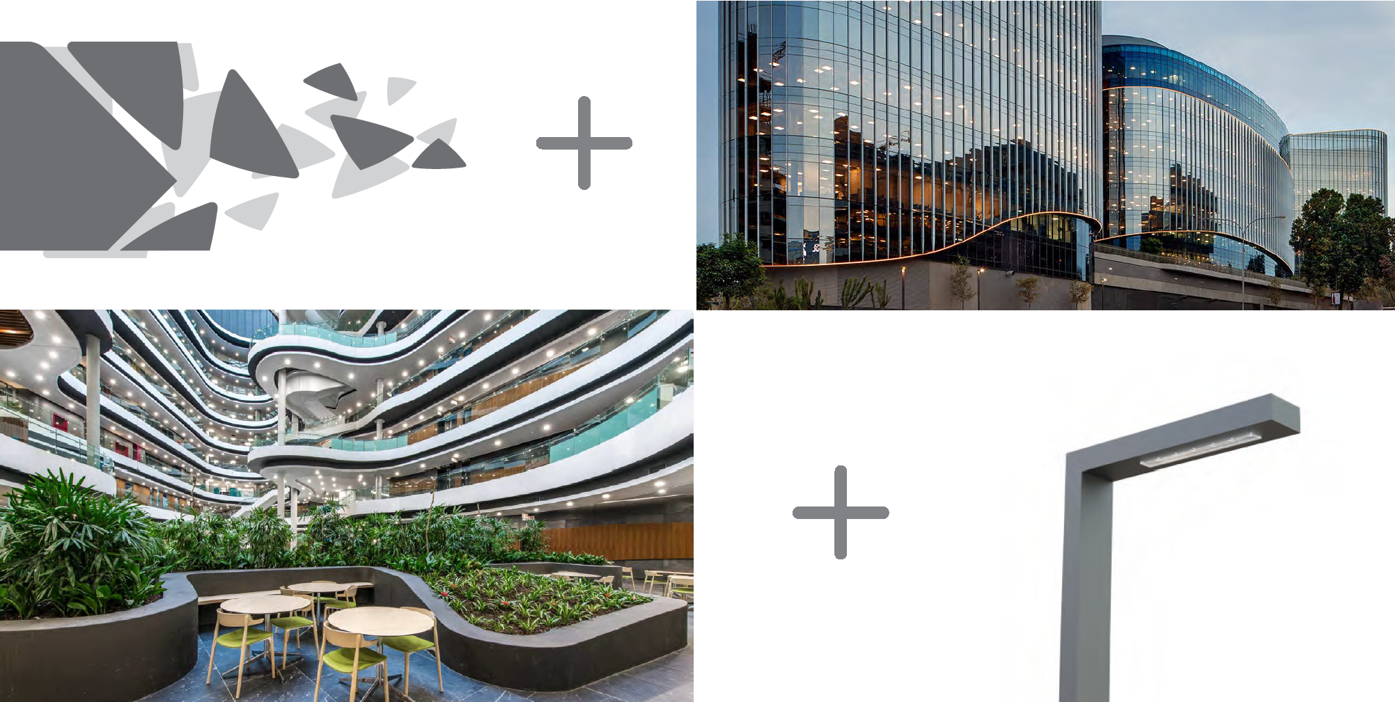
The concept was predicated on the idea that Discovery—the building, the brands, and the people together— is greater than the sum of its parts. It envisioned the whole as both a home and a confluence for this collective energy, represented by nodes or particles. Our ability to actualise this in a design system that literally provides the building blocks meant that everyone could consciously engage with the aesthetic.
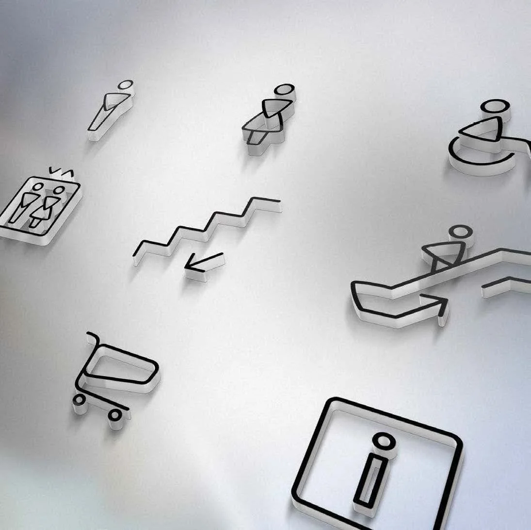
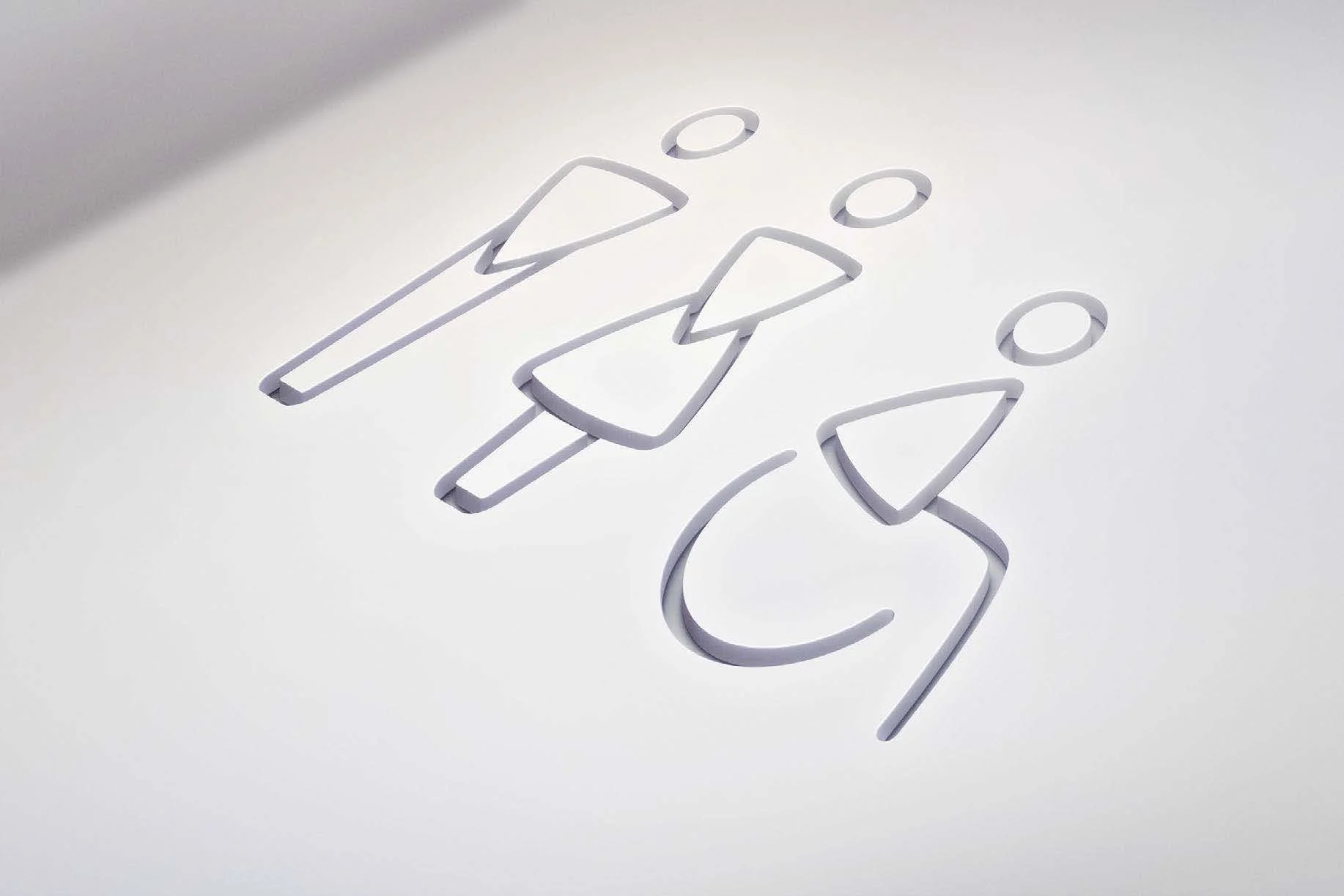
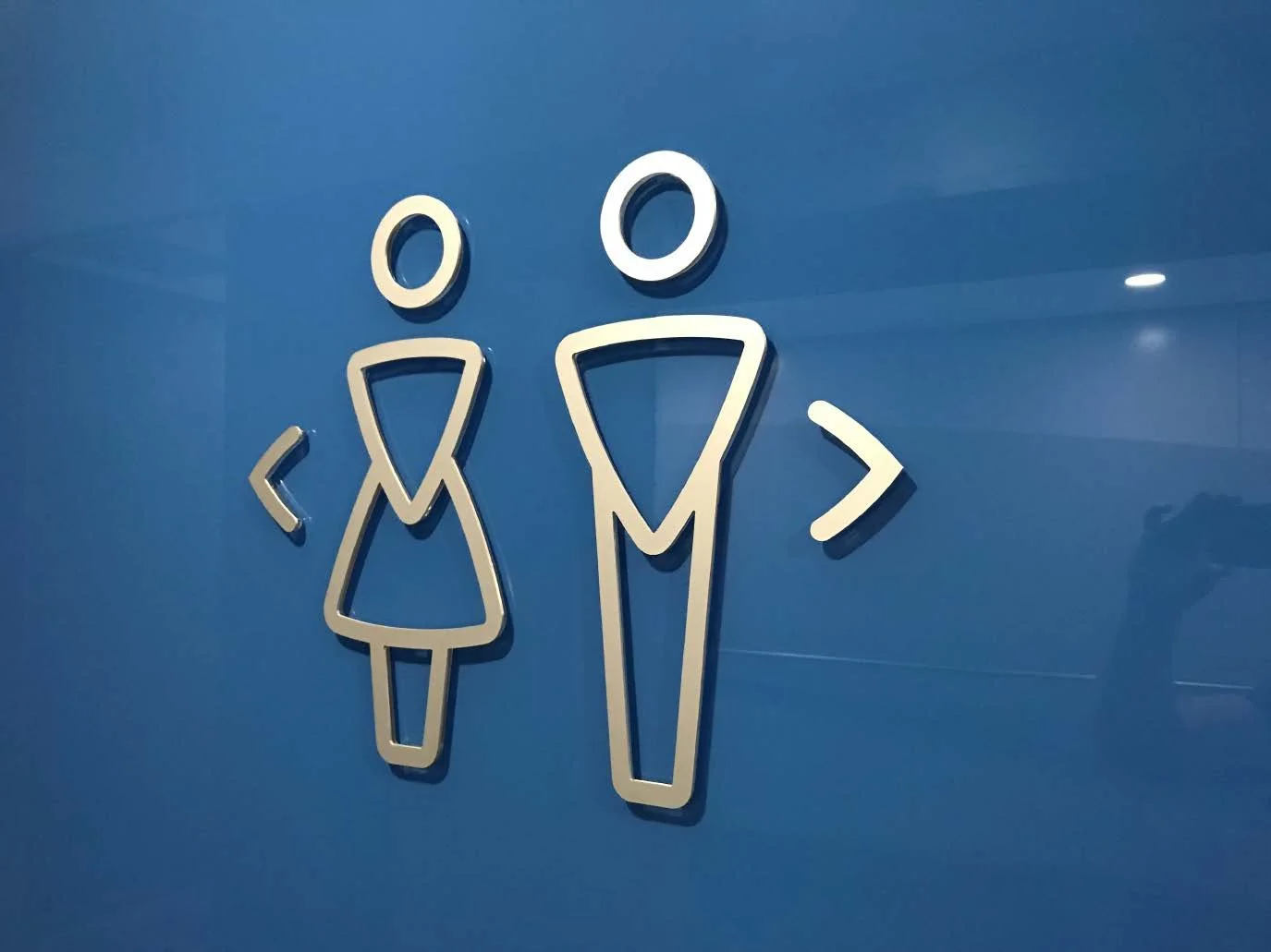
Iconography
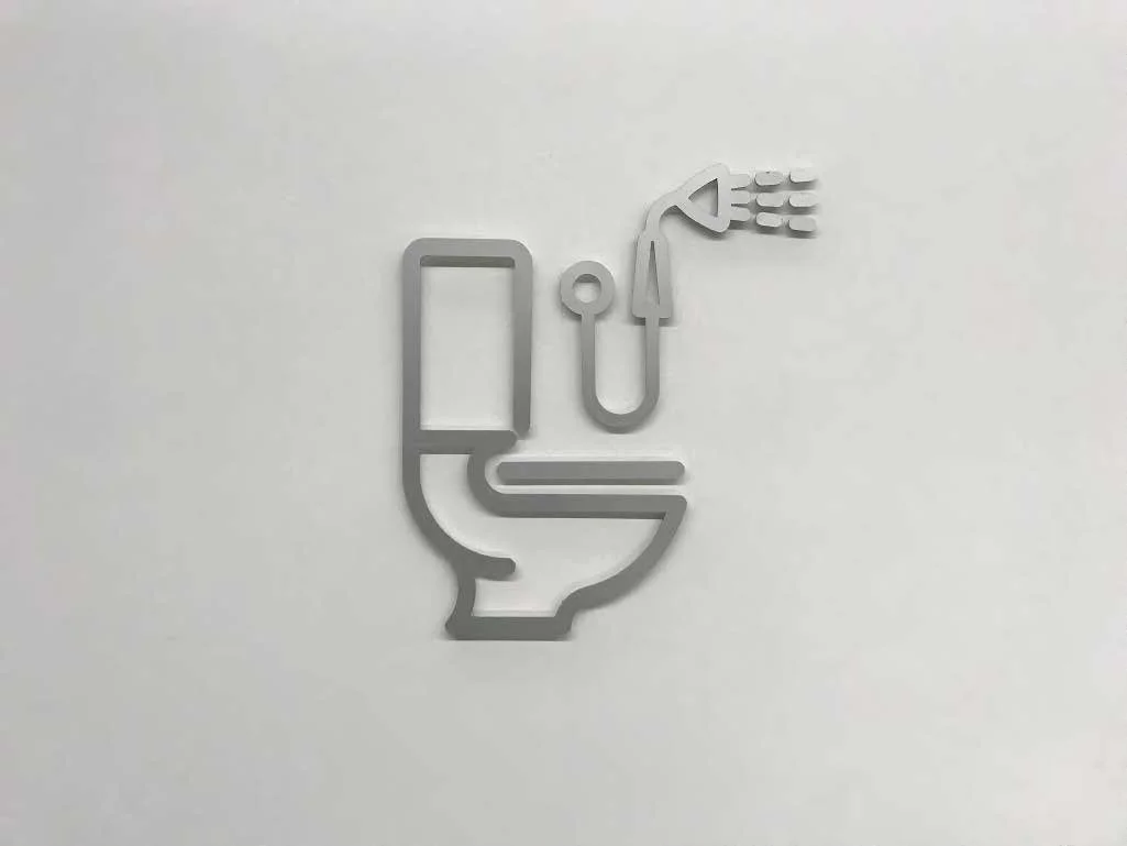
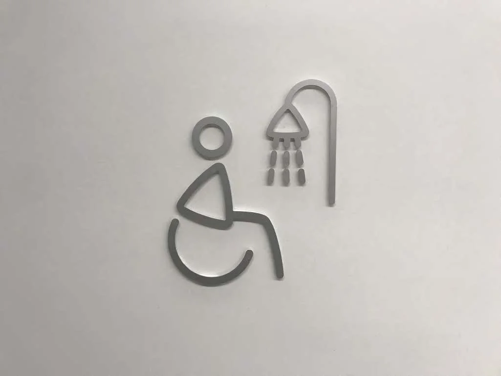
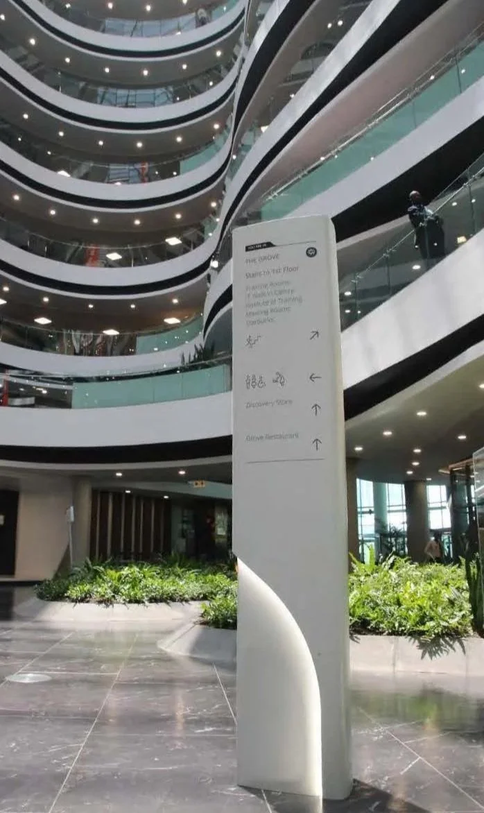
As part of our work we created a visual language and subsequent collateral for a bespoke wayfinding system. This included a custom icon suite that was made specifically for the project and has now been incorporated into the identity.
The icons were designed so that their line thickness could be adjusted to adapt to 2D and 3D applications whilst retaining a consistent visual weight and legibility.

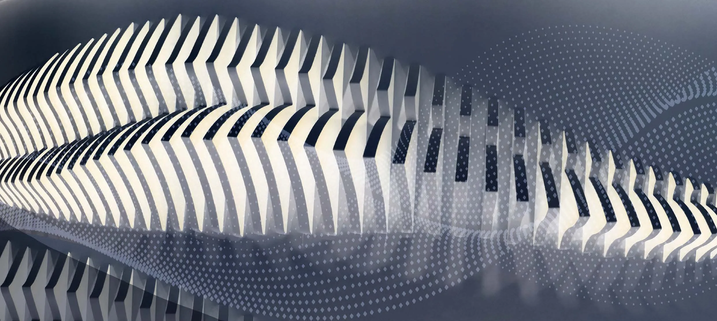
Lighting Design
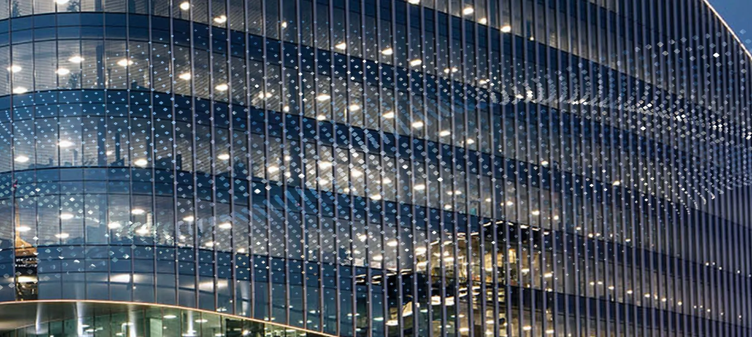
Extra ground-level lighting for the central concourse was required. The volume and ceiling design did not allow for down lights to be used. We were briefed to develop a “street light’ type design that echoed the building’s aesthetic but still referenced the particle concept. The idea was to create a continuous flow from the exterior street lighting that then flowed through the building’s interior.
The custom design integrated well with the building’s interior and exterior look, and we were subsequently asked to develop all upper floor signage using the same form as a precedent.
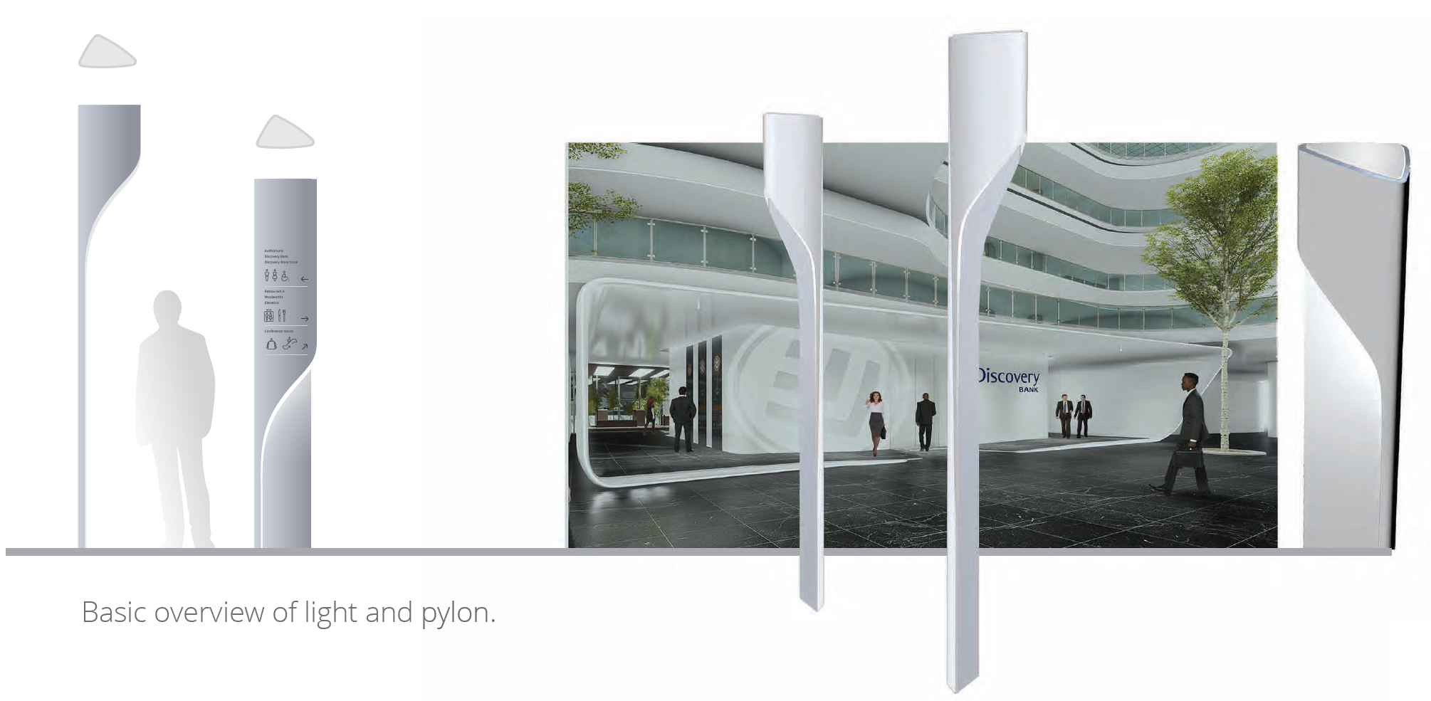
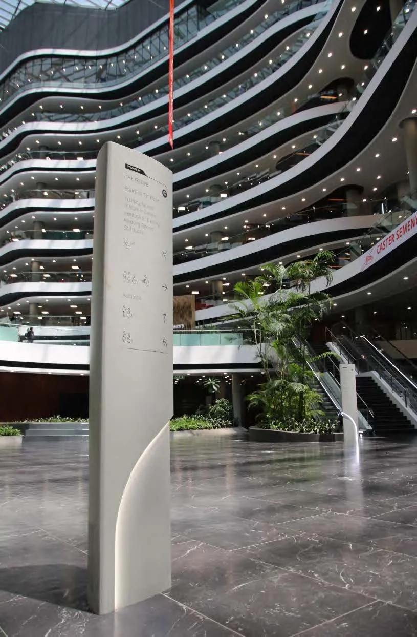
Wayfinding Pylons
The pylons all have the same profile shape as the lighting.
This shape references the particle concept, the footprint of the atria and also allows for wayfinding to be seen from 3 approaches.
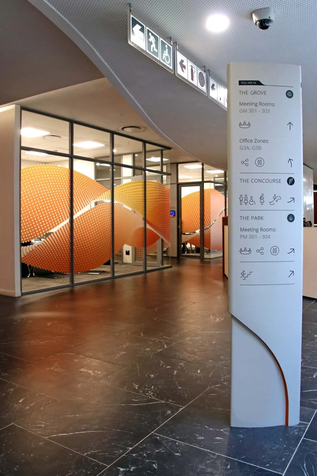
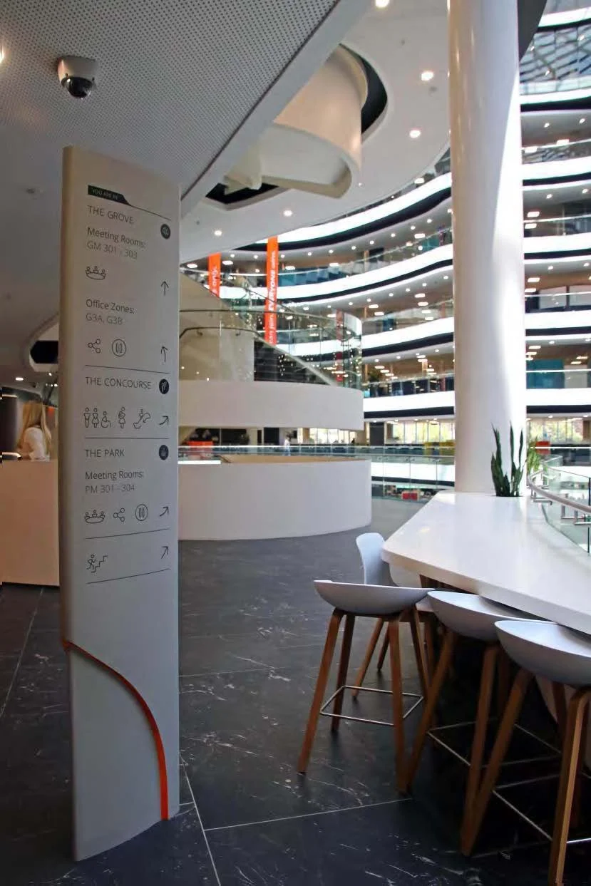
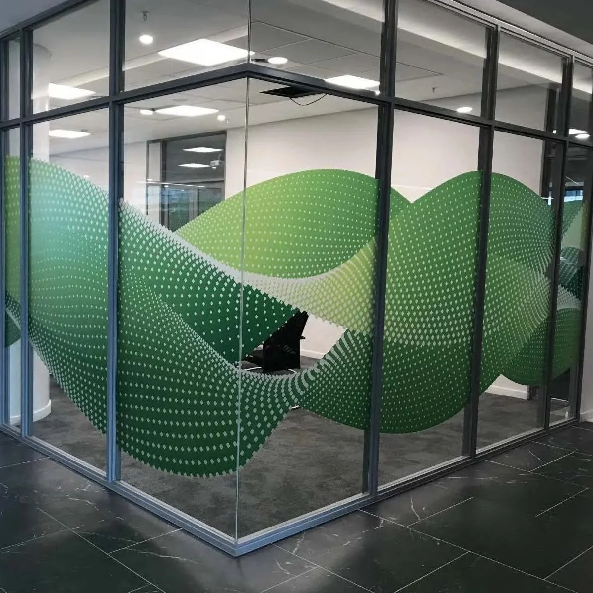
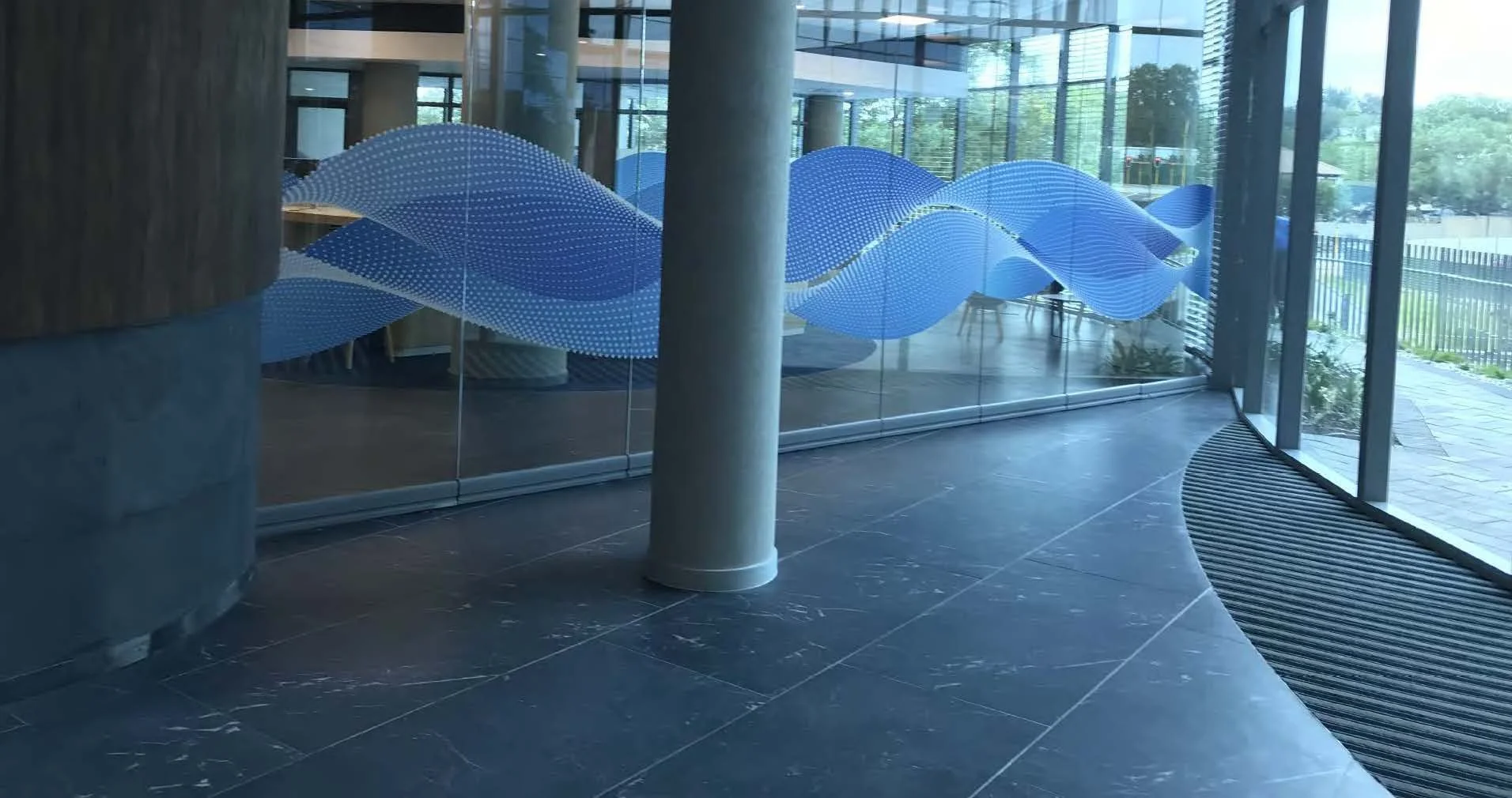
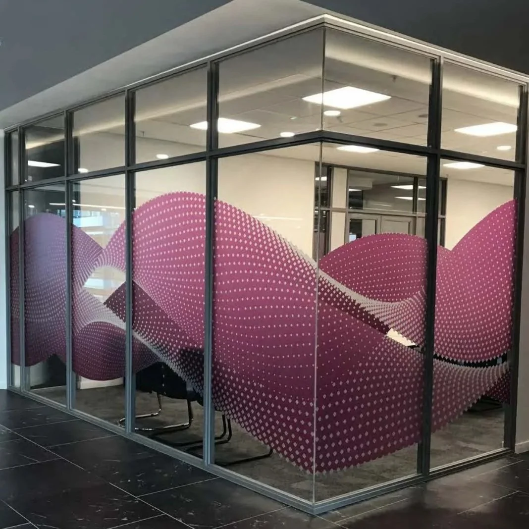
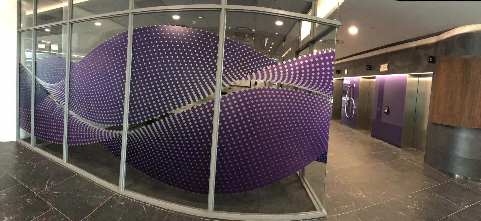
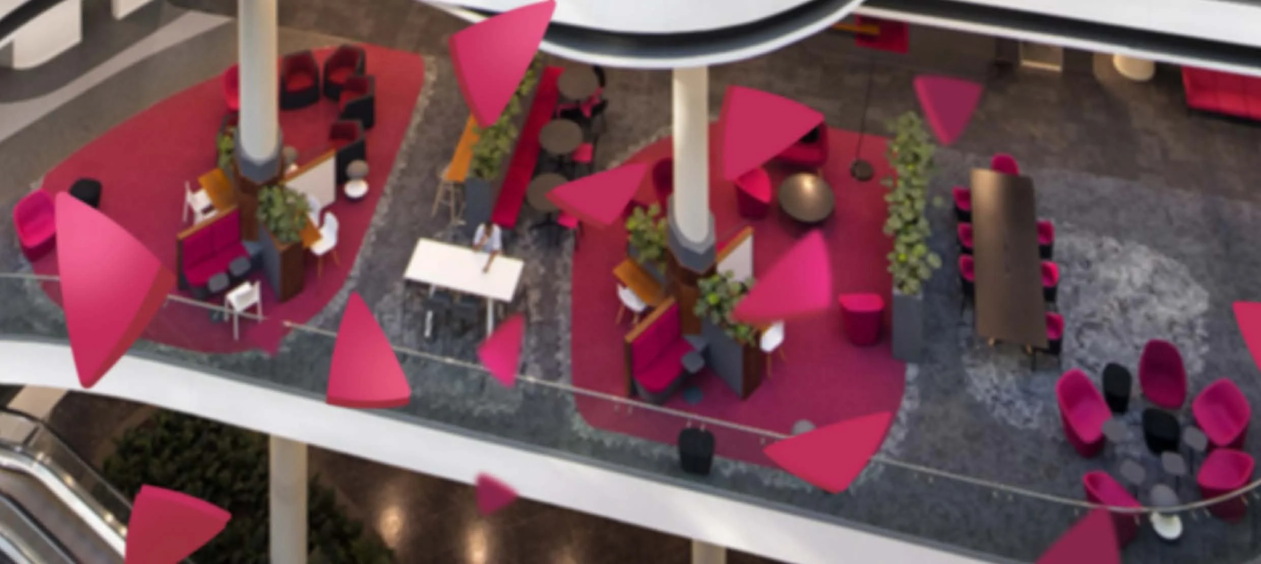
Floor differentiator & meeting rooms
Floors in the building are differentiated by colour. This system was augmented by the use of vinyl on meeting rooms across the building but particularly in the building core – enabling the floor colour stack to be seen across atriums and from escalators.